
Dear reader, we owe you a heartfelt apology for letting you wait for our final installment of the 21 Law of UX series. We have poured our hearts and souls into crafting an ending that we hope will not only meet but exceed your expectations. This last article will explain the last remaining 5 principles in the series, wait no more and let's jump-start our last journey.
Doherty Threshold
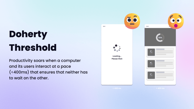
Doherty’s threshold states that productivity soars when a computer and its users interact at a pace (<400ms) that ensures that neither has to wait on the other. Studies have shown that users may become frustrated when they feel waiting too long for something to respond, especially when handling urgent tasks. Designers can implement a loading animation to encourage users to stay and wait for the page to load the interface, even though the animation didn't make the loading faster, users might be more tolerant if they receive feedback rather than a blank screen.
Pareto Principle
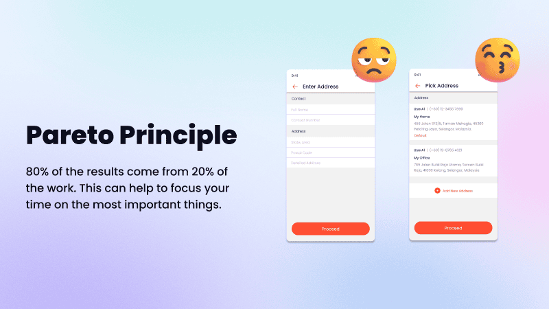
Pareto Principle states that 20% of your effort can get you 80% results. As for UX, means that 20% of the design change may end up showing 80% of the outcome. Designers should identify and prioritize those that benefit users the most rather than fixing all the minor problems. For example, UX designers can develop a low-fidelity prototype that covers all the core features to construct rather than all the functions available in the interface. This principle helps us to focus our time on important things.
Postel’s Law
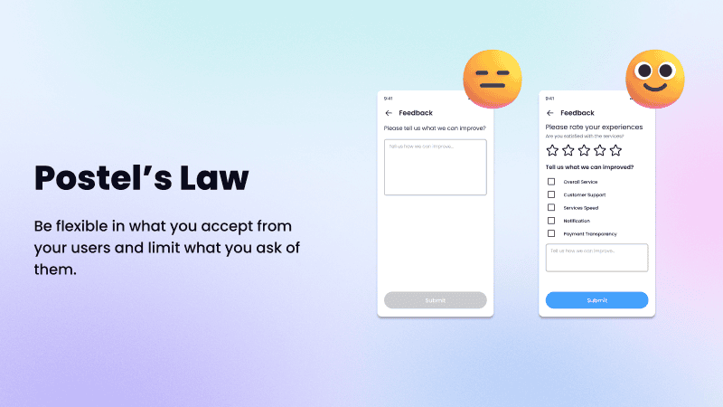
Postel's law (also known as the Robustness Principle) stated that be flexible in what you accept from your users and limit what you ask of them. Designers should design more user-friendly interfaces by accommodating variations and diverse input. However, we should have strict standards for the information we show to the user should be clear and understandable.
Tesler’s Laws
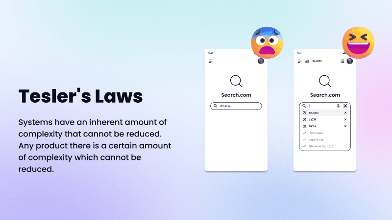
Teslar Laws state that there is a certain amount of complexity that can not be eliminated in any system. The important/core features should not be removed since they may lead to more complex issues. It's crucial to find the right balance between simplicity and complexity. Use the info tips function if necessary to help users to ease the navigation in a complex interface.
Occam’s Razor

Occam’s razor states that select a design with the lowest possible complication. In UX, it encourages designers to remove unnecessary elements that will decrease the efficiency of the design process. However, in different aspects, design should be considered complete only when all the necessary elements are added to your design. Shaving all the complexity without losing all the core elements in the interface helps users to enjoy aesthetically pleasing and easy-to-use experiences.
Closing Word
As we draw the curtains on our journey through the 21 Laws of UX, we extend our heartfelt gratitude to each one of you for embarking on this exploration with us from the first blog until this final chapter.
Your dedication to learning and growing alongside us has been truly inspiring. But remember that the journey of mastering UX design is a long path. We encourage you to continue to explore and experiment more.
On behalf of our entire team, giving our deepest gratitude for joining us on this odyssey of knowledge. We hope that the insights shared in this series have not only broadened your understanding of UX design but have also inspired you to make a positive impact through your work. Thank you once again for your unwavering support.