Have you ever heard of the 21 Laws of UX, whether you are a rookie or a professional UX designer, using these principles surely helps as a guide to creating winning designs. In this article, I'm going to explain Heuristics Laws and how to imply in our design to create a better user experience for our user. Reading this can help you to use heuristics to identify potential usability issues and make informed design decisions in your product. Let's dive right in.
What is Heuristic Law?
Heuristics laws are a set of general principles or guidelines for evaluating the usability of a user interface. As designers, our role is to prevent users from being confused when using our product, using heuristics helps us to identify potential usability issues and make informed design decisions. Below are the principles of Heuristics laws.
Aesthetic-Usability Effect
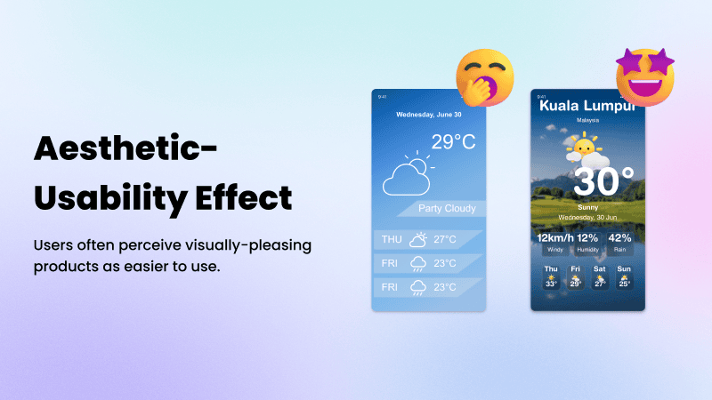
Did you know users are strongly influenced by the aesthetics of any given interface, even when they try to evaluate the underlying functionality of the system? This explains that visually appealing design may cover up usability issues and keep them from being noticed during usability evaluation.
Our team always try our best to utilize these design principles to enhance our project management and design outcome. Building a positive user experience and improve our customer satisfaction.
Fitt’s Law
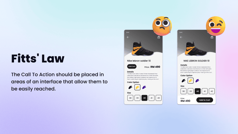
In 1954, Psychologist Paul Fitts studies the motor function in humans and accurately predicts the time taken to move and select a target. It helps us to understand that the time to reach or touch a target depends on how big and far the target is from you. User interface design and user experience are both perfectly covered by this law.
By utilizing Fitts’s Law, you can design and control how the target element in the interfaces allow users to quickly interact with it or make it harder to select in order to reduce accidental click to efficiently improve the user's experience.
Goal-Gradient Effect
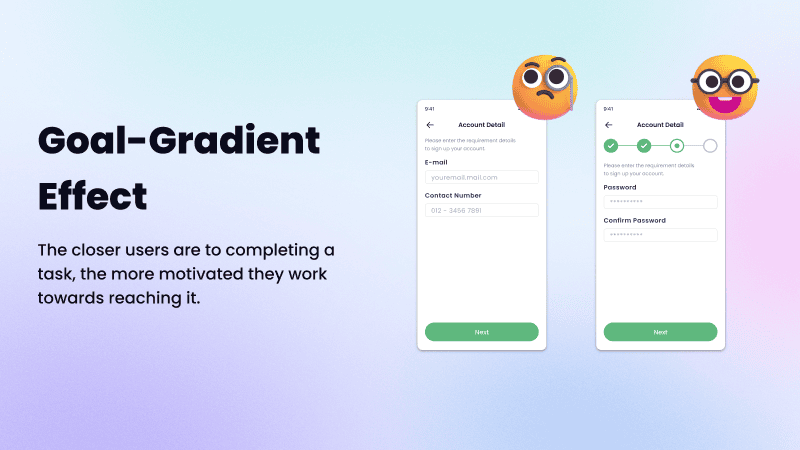
The goal-gradient hypothesis by Clark Hull in 1932 states that the tendency to approach a goal increases with proximity to the goal. It is simple to understand that things close to are more likely to be completed first, while those farther away are completed later. When users are closer to their goal, the faster they are going to take action to complete it.
The Goal-Gradients Effect can be used for displaying a graphic of the progress made or emphasizing the steps still to be taken. This can be observed frequently in gamification elements such as progress bars, badges, and profile completion percentages. Providing artificial progress towards a goal will help to motivate users to complete the task.
Hick's Laws
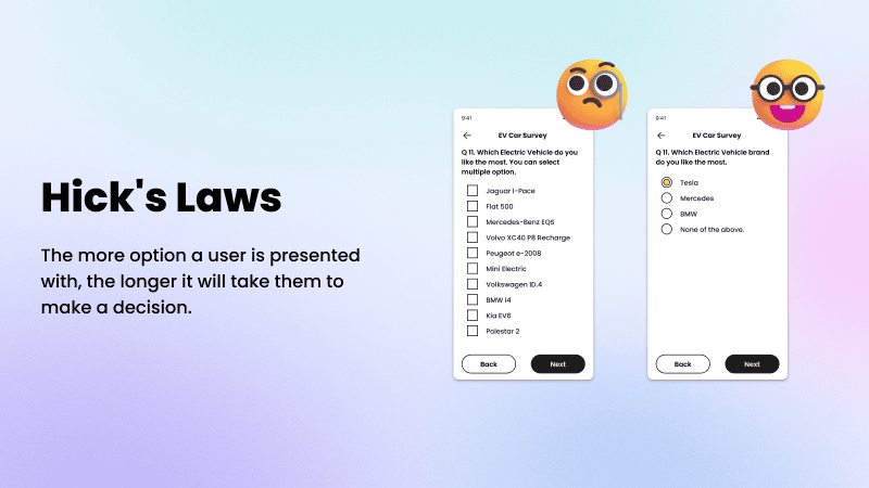
Hick's Law stated that overload choices may end up in choice or analysis paralysis for an individual. Sometimes fewer options can make things simpler and more enjoyable to help decrease their user cognitive burden A good user experience interface requires functions that meet up the user's needs. When designing an interface, try to keep options as few or simple as possible to keep the user making their decisions faster. It can be seen in a drop-down item that many components are arranged and categorized based on their category, so that users can search for what they are looking for faster and easier.
Jakob’s Laws

By following Fitts’s Law, designers can create interfaces that allow users to quickly and accurately interact with it. Designing user interfaces with key components placed closer and larger so that users can interact with them quickly and accurately will improve the user's experience.
Design patterns exist for a reason since it saves people time by not having to re-learn how to interact with a site. Designers need to be familiar with it so that they can create a product more focused on delivering a better experience and easy for users to manage their tasks. Don't try to create a brand-new different product without a good reason, since it might be counterproductive.
MIller’s Law
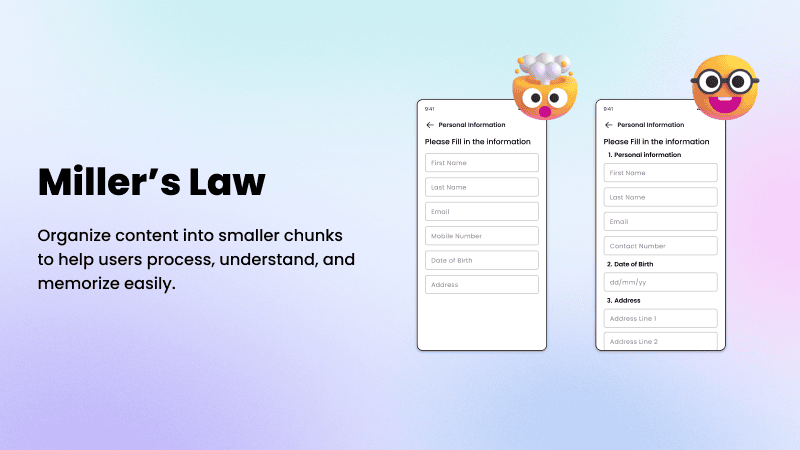
George A. Miller, a cognitive psychologist, introduced Miller's Law which states that the average person can only keep 7 (plus or minus 2) items of information in their working memory at a time. This explains that user attention is limited, having more than 7 elements creates confusion in user minds.
By keeping design principles in mind, designers can create an interface with only essential information. The chunking method helps to ease complex tasks by organizing and the information in a way that is memorized and figure out the requirements without having to exert too much mental effort.
Parkinson’s Law
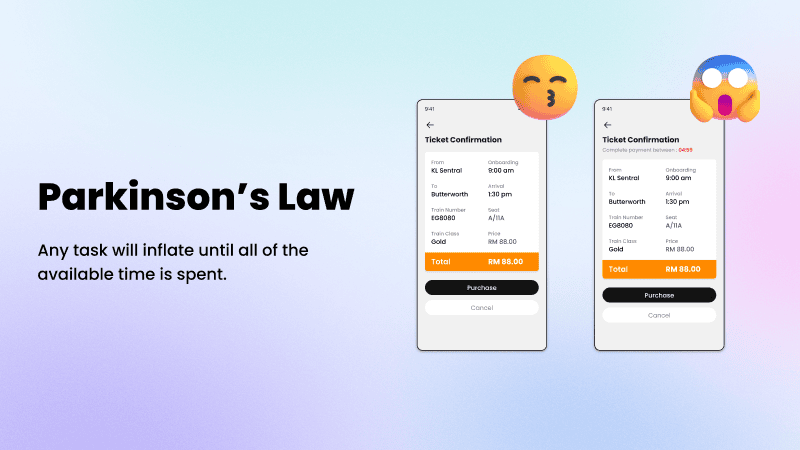
Parkinson’s Law states that a task will inflate to take up all the available time. When a task having a longer time to finish, the user will inflate until all of the available time is spent. However, when users have a shorter time limit, they will be more focused on finishing the task on time.
Designers can limit the time it takes to complete a task to what users expect it’ll take. An example of its application is the existence of a payment time limit when shopping online. Users are more likely to prioritize the task if there is a time limit.
Closing Word
Time to wrap up the content, we discussed all the 7 Heuristic Laws and how to use them in our design. These guidelines are general rules of thumb and will mostly be applicable to any web & mobile application. Try to practice these laws to create a seamless and enjoyable experience in order to reduce usability pitfalls for your user. Keep in touch with us since we will talk about Gestalt Laws in the next article. See you next time.